Renko trading guide for learning the basics of using Renko charts for day trading. The guide will be used to discuss the indicators, trade setups, and strategies we used in our trading method. Also discussed will be the concept of filtering low odds trades.
Renko Trading Guide Key Takeaways:
- Renko Chart Basics: Understanding Renko charts and how the bricks on the charts are made.
- Renko Trading Indicators: Discussion of our indicators and why the best Renko indicators are momentum.
- Renko Trade Setups: Discussion of how our Renko indicators are combined into trade setups.
- Renko Trade Setup Filters: Discussion of the use of trading filters, which have the objective of avoiding lower odds trades due to certain Renko chart conditions.
Renko Trading Guide Table Of Contents
Each section in the Renko trading guide will discuss the topic using Renko charts and include the link to a related trading video.
- What Is A Renko Chart?
- Making Renko Chart Trading Bricks
- Renko Chart Momentum Indicators
- Renko Price Envelope Reverse
- Renko Midline Reject
- Renko Price Extreme Reverse
- Renko Chart Trade Setup Filters
What Is A Renko Chart?
The Renko trading guide begins with: What is a Renko chart? And then, we want to compare the Renko charts to the more traditional charts like bar charts or candlestick charts, especially for day trading.
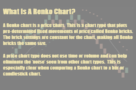
What is unique about Renko charts is that they are price charts.
A price chart is a type of chart that plots predetermined fixed price movements, called Renko bricks. This fixed movement is the brick setting size, which is constant for the entire chart, making all Renko bricks the same size.
The key characteristic of a price chart is it does not use time or volume, which can help eliminate the noise seen from other chart types. This will be especially clear when we compare our Renko chart to a bar or candlestick chart.
Renko Charts Compared To Candlestick Charts
You’re now looking at a Renko chart, and you will immediately see that every brick is the same size. You can also see the visual clarity regarding having no bricks overlap. All the bricks are at 45° angles to each other.
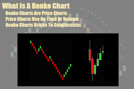
If you’re looking at a green brick, the low of the current brick is next to the high of the previous brick. And then, you can see the first swing high, followed by a red brick, where the red brick high is at the low of the green brick.
You can see that each new brick is a break of the previous brick’s high by the setting size if it’s a series of up bricks or a break of the low of the previous brick if it’s a series of down bricks.
Then, when you get a combination like the reverse from a green brick to a red brick, you will not get a new brick until the low breaks the low of the green brick by the setting size.
And then, if you reverse from a red brick to a green brick, you will not get a new brick until the high increases the previous brick’s high by its setting size.
Video: What Is A Renko Chart?
I do not trade the Renko charts from the bricks only. My trading charts have my Renko trading indicators as components for trade setups. But I think you can see how the price movement from a chart like this is clearer and not so noisy and could be more tradable.
Now, I want to look at the comparison of the Renko chart with the candlestick chart.
The two swings you are looking at cover the same amount of time. But what would you possibly do to trade the candlestick chart? I can show you my Renko trading indicators on that chart, and you will not see any trade setups. I see the move down and then the move straight back up.
You can now see that I have marked the Renko chart with some yellow circles. Do you see any potential trade setups near the same areas on the candlestick chart?
You will see this chart again with my Renko indicators, but these are the locations of our Renko trade setups for this period. Each one of these yellow circles was a Renko trade.
Renko Trading Guide For Making Renko Chart Bricks
Now, the guide discusses how the Renko chart bricks are made and how price charts are unique.
Here is an outline of the different things we will discuss:
- Renko Brick Settings
- Missing Prices
- Are there prices not seen because they are smaller than the brick setting?
- Differences between completed charts and realtime bricks
- Renko Classic Charts
- Renko Price Wick Charts
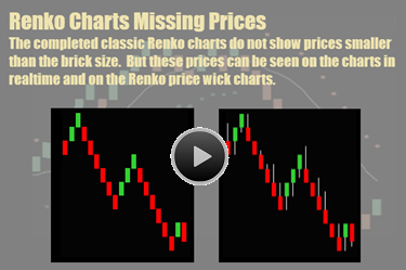
Renko Charts And Missing Prices
This section of the Renko trading guide is important to understand because it is said that Renko charts don’t show all prices.
The Renko charts examples use a brick setting of 3 ticks.
The completed classic Renko charts [left side chart] do not show prices smaller than the brick setting size.
However, these prices can be seen on the charts in realtime and the Renko price wick charts [right side chart].
The price wicks show prices higher than a completed down brick and lower than a completed up brick. These are the prices missing from the classic chart.
Realtime, all prices are seen. The last brick on each of the charts is made in realtime. This is why we see prices below a red brick – it is not completed yet.
Realtime Renko Bricks
This is a classic chart, and the last brick is an uncompleted realtime brick. You can see the price action to the point:
- The brick opened at the green brick high and has gone down 4 ticks, and is now 1 tick lower than the green brick low.
How will this brick be completed?
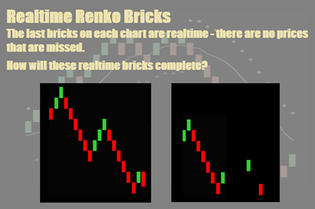
The brick will continue down 2 more ticks and become a completed red brick. Or the brick will reverse and complete 3 ticks higher than the previous up brick high and become a completed green brick.
You are now looking at the price wick chart with a brick setting of 3 ticks. Again, the last brick is an uncompleted red brick.
These bricks will be completed as red or green bricks like the classic bricks. Again, by closing as a red brick, 3 ticks lower than the green brick [body – not price wick] low. Or it will close 3 ticks higher than the green brick high and be a completed green brick.
You can see what the price wick on the completed brick would look like and how the wick on the red brick would be above the brick.
Video: Making Renko Chart Trading Bricks
So, this is an example of how Renko bricks are made and the differences between completed bricks and realtime bricks, along with the differences between Renko classic charts and price wick charts.
Have you ever done a Google search for Renko chart disadvantages?
If so, the issues will be with the Renko brick setting and the loss of some price points. But although this may be the case for completed charts, in realtime, when trading is actually occurring, all of the prices are seen.
Renko Trading Guide About Momentum Indicators
Now, the Renko trading guide will discuss our Renko chart momentum day trading indicators and their basic characteristics.
You are looking at a Renko chart; it is a chart with a brick setting of 3 ticks that are used for day trading the British Pound futures.
Our Renko trading strategies use a combination of 3 different indicators, all of which are momentum indicators.
What Is Momentum In Day Trading?
The Renko trading guide is going to show our 3 different momentum indicators. But to begin with, what is momentum?
For Renko chart trading, momentum measures the amount of price change over a period, helping to determine the strength or weakness of the current direction. Momentum can then show price continuation or an extreme, leading to a price reversal.
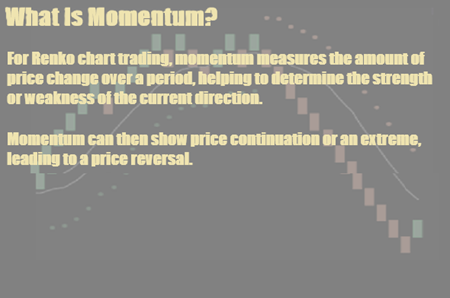
I have found momentum indicators effective for the Renko charts because they are price only charts, ignoring time or volume.
You can see 2 links to posts on our website for momentum trading and our Renko momentum trading indicators.
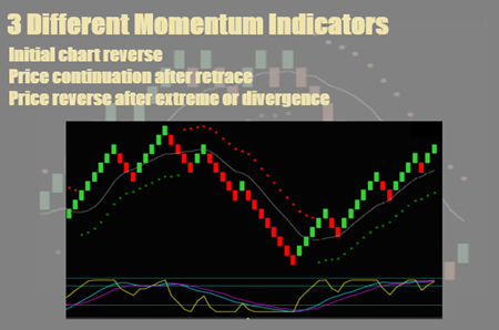
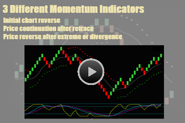
Our Renko trading strategies use the 3 different momentum indicators on the chart. The indicators provide different momentum speeds to show the current condition and direction of price movement.
Renko Chart Momentum Indicators Characteristics
Initial Chart Reverse
- Green and red dot price envelope on Renko chart.
- This is a medium speed indicator that is intended to show where a new price swing begins from a momentum reverse to positive or negative.
Price Continuation
- The blue-purple line below the chart. This is a slow momentum indicator intended to show the momentum flow on a price retracement.
- Do you see how after the price envelope dots changed from green to red, there was a price retrace to the gray midline, but slow momentum continued down?
- This is momentum flow and an indication of price continuation.
- The yellow line is below the chart. This is a fast momentum indicator that is intended to show momentum resuming with a momentum hook pattern.
- With momentum flow, fast momentum breaks the extreme line, moves back into the middle of the range, and then breaks the extreme line again.
Momentum Extreme
- Slow momentum moves above and below the extreme line, and the lines cross.
- This is intended to show a price and momentum extreme or divergence that can lead to a reverse in the direction of the price.
Renko Chart Momentum Trading Indicators And Trade Setups
The Best Renko Indicator For Trading Is Momentum
Video: Renko Chart Trading Momentum Indicators
The video will look at our 3 Renko momentum indicators on a chart and cover their basic descriptions. Then, we will discuss these 3 momentum indicators individually and how they are used as components for our Renko trade setups.
Renko Trading Guide And Trade Setups
The Renko trading guide showed our 3 momentum indicators and will now discuss our Renko trade setups and how these indicators are used. Note that we use at least 2 different indicator components for our trade setups – we do not trade mechanical signals.
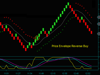
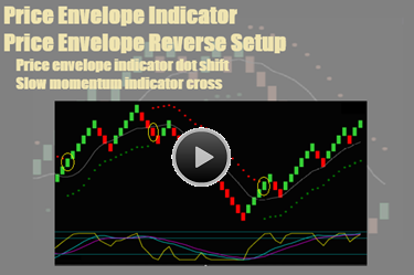
Renko Price Envelope Reverse
In this video, we will further discuss the price envelope indicator along with the price envelope reverse Renko trade setup.
The price envelope reverse or initial swing reverse is our Renko trade setup for the beginning of a new price swing.
- The swing begins with a shift in the price envelope indicator dots from red on top to green on the bottom or from green on the bottom to red on the top.
- A medium speed momentum reversing from positive to negative or negative to positive causes the dots to shift.
Combined with the price envelope, the Renko slow momentum indicator is also a component of this trade setup.
- The trade setup increases its odds of price continuation by having the medium and slow momentum indicators leading the price.
- To confirm the trade setup, the blue line must be above the purple line for a buy or below the purple line for a sell.
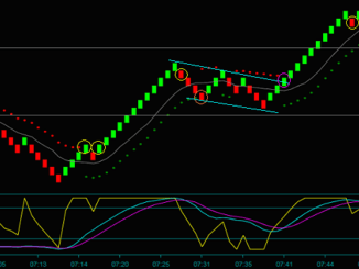
You can now see the Renko chart now has yellow circles marked on it. These circles show the price envelope reverse trade setups.
Again, at the time of the setup:
- There was a price envelope indicator dot shift.
- The slow momentum indicator crossed or had previously crossed, in the direction of the trade.
Video: Renko Price Envelope Indicator
In the video, we will look at the Renko price envelope indicator and price envelope reverse trade setup and discuss the setup components.
Next, we will examine the Renko midline reject trade setup and its indicator components. This is a price continuation setup and is used for addon trades.
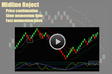
Renko Midline Reject
We will discuss the Renko trade setup called a midline reject, specify the indicator components, and locate the setup on the Renko chart.
The midline reject is a Renko price continuation trade setup and one that is used for addon trades.

We view the price continuation after the price envelope reverse [where the price envelope dots shift colors] using both the slow and fast momentum indicators.
Renko Midline Reject Pattern
The blue circles are both Renko midline reject price patterns. You can see 2 different patterns, differing by the number of bricks in the pattern.
- Slow momentum continues to move [flow] in the direction of the trade while the price retraces after the price envelope reverse.
- Fast momentum confirms the slow momentum flow with a hook pattern called a fast momentum hook.
- The fast momentum hook is a momentum resumption pattern.
- After breaking the extreme line, fast momentum retraces with price and moves back into the middle of its scale.
- As price resumes, so does fast momentum, breaking back through its extreme line – resuming momentum and price continuation.
- The fast momentum hook is a momentum resumption pattern.
Looking at the Renko chart, you can see:
- The orange line from the red brick low to the green brick high is a price retrace after the price envelope reverse.
- The purple line from the green brick high and back down is price resuming its direction.
- This is led by slow momentum flow and a fast momentum hook, which you can see in the purple rectangle in the momentum window.

Now compare the purple box to the blue circles – is this also a Midline Reject?
No
- This is not a midline reject – the test brick closes completely below the midline.
- This is not the midline reject pattern – there are too many bricks.
- Slow momentum is not flowing up on the price retrace to the midline.
- There is no fast momentum hook.
Do All Midline Rejects Indicate Price Continuation?
Look at the chart again and blue circle3. This is a Renko midline reject trade setup like the first 2 blue circles and would be an addon to the Renko price envelope reverse, yellow circle2.
Although the last 2 purple circles are midline reject patterns, slow and fast momentum are not showing price continuation, and these would not be Renko addon trade setups.
Purple Rectangle Around Momentum
- Slow momentum is above the extreme line and around the maximum extreme.
- Momentum is an important consideration for price continuation – we would not want to add to trading size without it.
Video: Renko Midline Reject
In the video, we will look at the Renko price envelope, and midline reject trade setups, including their indicator components – marked on the chart where the trades would occur.
Next, we will look at our third Renko trade setup – the price extreme reverse. This price and momentum extreme trade setup is used as a swing reversal trade before the price envelope reverses.
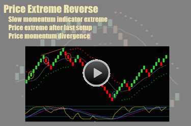
Renko Price Extreme Reverse
Now we will discuss our 3rd Renko chart trading setup, the price extreme reverse. This trade setup is unlike the price envelope reverse and the midline reject.
Instead of directional trades like the price envelope reverse and midline reject, the price extreme reverse is a counter direction trade. Counter direction means the trade will be opposite the price envelope indicator dots.
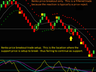
When you look at the Renko chart, you can see 2 circles. These 2 circles are potential Renko price extreme reverse trades, but only 1 can be traded.
What are the Renko chart trading price extreme reverse setup components, and what makes the 2 marked circles different?
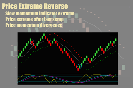
Renko Price Extreme Reverse Trade Setup Components
The Renko price extreme reverse trade has 2 setup components.
- Slow momentum extreme
- The slow momentum indicator shows this when the blue and purple lines are above or below the extreme line.
- Price extreme
- For the price to be considered extreme for our Renko chart trading, it must have moved 5 or more consecutive bricks after the price envelope reverse or the last trade setup.
Based on these trade setup components, the purple circle on the left cannot be traded. Although there are 5+ consecutive bricks after the price envelope reverse, only the blue slow momentum line is above the extreme.
On the other hand, the blue circle on the right is a Renko chart trading price extreme reverse trade. There are 5+ consecutive bricks after the last trade setup, which was a midline reject. And both of the slow momentum indicator lines are below the extreme.
The Renko trading chart is marked as follows [note that there are Renko chart trade setups that haven’t been marked:
- Yellow circle1 – price envelope reverse buy
- Pink circle – price extreme reverse that cannot be traded
- Yellow circle2 – midline reject addon sell
- Blue circle – price extreme reverse buy that can be traded
What Is A Price Momentum Divergence?
Another indication of a Renko chart momentum extreme is a price momentum divergence.
- Price momentum divergence high – price higher high and momentum lower low
- Price momentum divergence low = price lower low and momentum higher low
In either case, the divergence has significance because momentum is lagging the price instead of leading it, which can indicate the start of a swing reverse.
You should see orange lines on the chart.
- Price is higher when momentum is lower
- Slow momentum is extreme
- The orange circle would be a price momentum divergence sell
Video: Renko Price Extreme Reverse
The video will examine the Renko price extreme reverse and price momentum divergence counter directional setups.
We have now looked at our 3 Renko indicators and trade setups.
I have also introduced the concept of Renko chart trading filters when comparing the 2 potential price extreme reverse trades. We will now discuss trade filters and using them to avoid trading setups with lower odds.
Renko Trading Guide For Trade Setup Filters
This section of the Renko trading guide is very important as it discusses Renko chart trade setup filters. We use Renko trade setup filters in our method to avoid the trading of potential setups where certain chart conditions have lowered their odds.
For instance, consider the price envelope reverse trade setup components:
- Price envelope indicator dot shift
- Slow momentum cross in the direction of the trade
If the trade setup occurs without a slow momentum cross, the trade will be filtered because of the lower odds of trading against momentum.
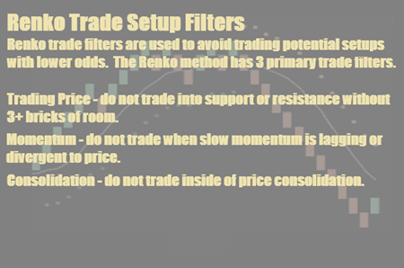
The Renko chart trading method has 3 primary trade filters.
- Trading Price – do not trade into support or resistance without 3+ bricks of room.
- Momentum – do not trade when slow momentum is lagging or divergent to the price.
- Consolidation – do not trade inside of price consolidation.
Additionally, do not enter a trade on a counter brick, meaning you don’t buy a red brick or sell a green brick. A price envelope reverse with a counter brick indicates lagging momentum.

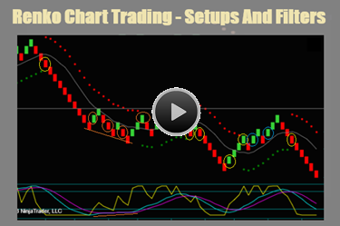
You are looking at a Renko trading chart. The marked circles are for Renko trade setups that do not have filters and could be traded.
- Yellow circle – price envelope reverse
- Purple circle – midline reject
- Blue circle – price extreme reverse
You can also see similar setups on the chart that do not have circles. These all have Renko chart trade setup filters and would not be traded.
Watch the video about the trade setup filters and why trade trades have been avoided.
Video: Renko Trade Setup Filters
The video will look at the Renko Chart Trading setups and discuss whether they are tradeable or should be filtered for price, momentum, or consolidation.
Also discussed is our objective for using Renko trade setup filters: Do the filters avoid more losing trades than cause winning trades to be missed?
This completes our Renko trading guide for day trading. You can continue to go through the numerous posts on this website to add to this guide and learn more about Renko trading.